 How to create a design language within your art
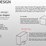
Sometimes, the difference between a decent image and an amazing image can be as simple as the idea behind it and how well that idea is conveyed. I’m not referring to how well you can render or light the subject matter in your image, rather how cemented that idea is throughout the image itself. In order to make an idea feel intentional to the audience, the concept artist must repeat this idea as an over arching theme throughout the image. The repetition of that idea becomes an visual pattern, and that pattern then, becomes the design language of the image. Having a solid design language not only ties the elements in your image together, into a unified and cohesive design, but it also solidifies your idea and its intent.
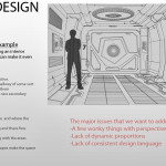
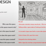
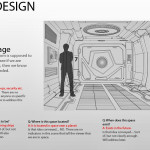
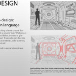
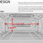
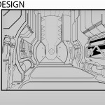
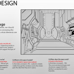
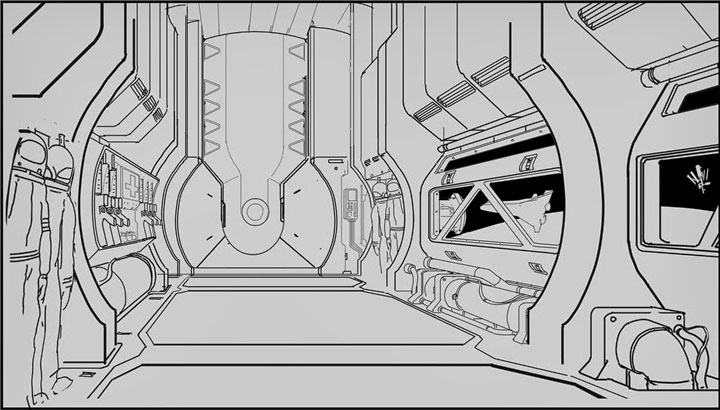
Let me explain by using one of my favorite students’ work, as an example. The assignment was to draw a interior hallway of a space station. (This is an example of a typical assignemnt I might get from work) My student, Eskinder, did a great job on his homework, but there is defiantly room for improvement. In the images below, I show him (and you) how to design an interior space station with intent, focus and clarity.
The notes explaining how to design a hallway interior using a solid design language are taken from my “Intro to Concept art” Class, which I am currently teaching at Richland College (located in Dallas Texas). Have questions? Ask away in the comments below, or drop me a line at: me@eliottlillyart.com

